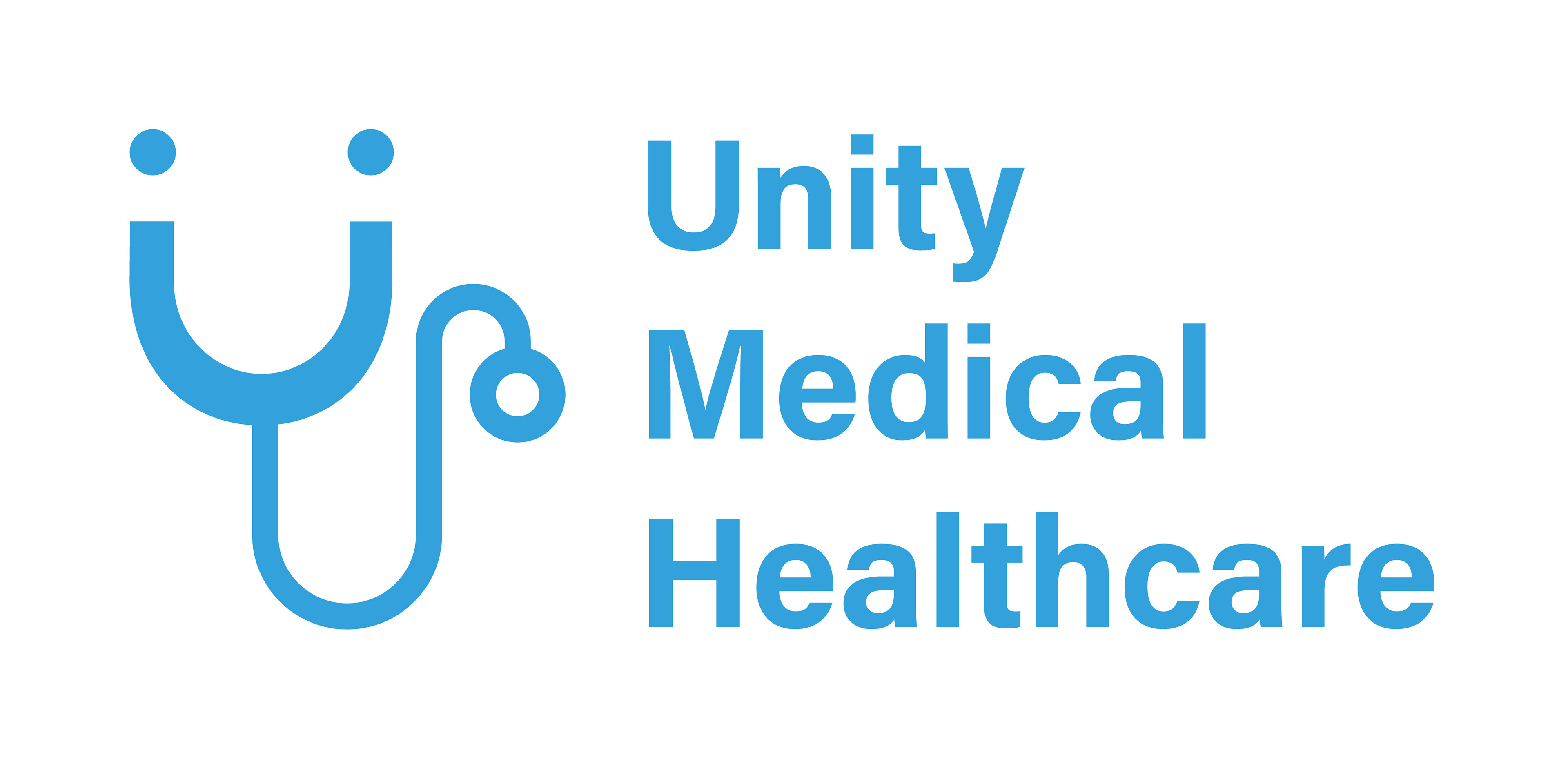
The logo reinterprets a stethoscope into a friendly, human-centered symbol, balancing clinical professionalism with a sense of warmth and care.
Rather than feeling cold or institutional, the identity is designed to make patients feel more at ease from their first interaction.
The Challenge
Healthcare brands often face a difficult balance:
● Too clinical → feels cold and intimidating
● Too friendly → risks losing credibility
At the same time, many healthcare platforms struggle with:
● Complex interfaces
● Unclear information
● Poor accessibility for elderly users
● Complex interfaces
● Unclear information
● Poor accessibility for elderly users
This project explores how branding and UX design can work together to create a clear, trustworthy, and user-friendly experience.
My Role
I developed both the brand identity and digital experience, including:
● Logo and visual identity system
● Brand direction and communication tone
● UI/UX design for a healthcare app
● Social media and advertising visuals
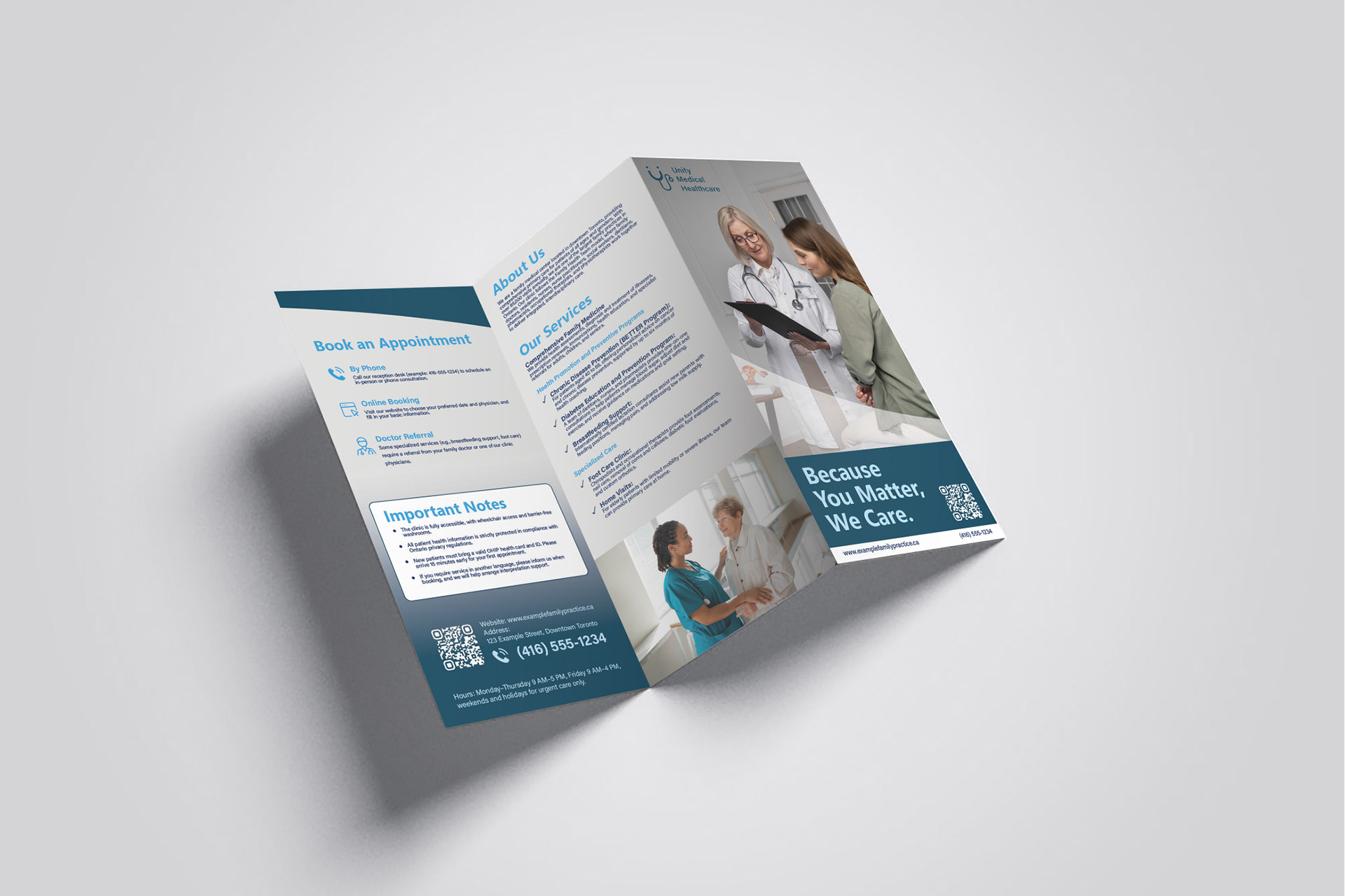
● Print materials (brochure, clinic touchpoints)
● Brand direction and communication tone
● UI/UX design for a healthcare app
● Social media and advertising visuals
● Print materials (brochure, clinic touchpoints)
Concept & Strategy
The core idea is:
➠ Make healthcare feel easier to understand and access
Rather than focusing only on aesthetics, the design prioritizes:
● Clarity of information
● Ease of navigation
● Emotional reassurance
● Clarity of information
● Ease of navigation
● Emotional reassurance
The goal is to reduce friction in the patient journey, from discovering the clinic to booking and managing appointments.

At Unity Medical Healthcare, your health is our priority.
We’re more than just a clinic — we’re your neighbors, here to offer care, trust, and compassion every step of the way.
We’re more than just a clinic — we’re your neighbors, here to offer care, trust, and compassion every step of the way.

Designed to be clean, welcoming, and easy to spot, so you can always find your way to trusted care at Unity Medical Healthcare.
Visual Identity
The logo transforms a stethoscope into a friendly, human-centered symbol, balancing professionalism with warmth.
The visual system is designed to feel:
● Clean and reliable
● Calm and reassuring
● Approachable without losing credibility
● Clean and reliable
● Calm and reassuring
● Approachable without losing credibility
This helps patients feel more comfortable and confident when interacting with the brand.
UX/UI Design
The mobile app is designed to simplify common healthcare tasks, including:
● Booking appointments
● Viewing medical history
● Connecting with doctors
● Booking appointments
● Viewing medical history
● Connecting with doctors
Key design considerations:
● Clear information hierarchy
● Simple and intuitive navigation
● Readable layouts for all age groups
● Clear information hierarchy
● Simple and intuitive navigation
● Readable layouts for all age groups
The interface reduces complexity and helps users complete tasks with minimal effort.

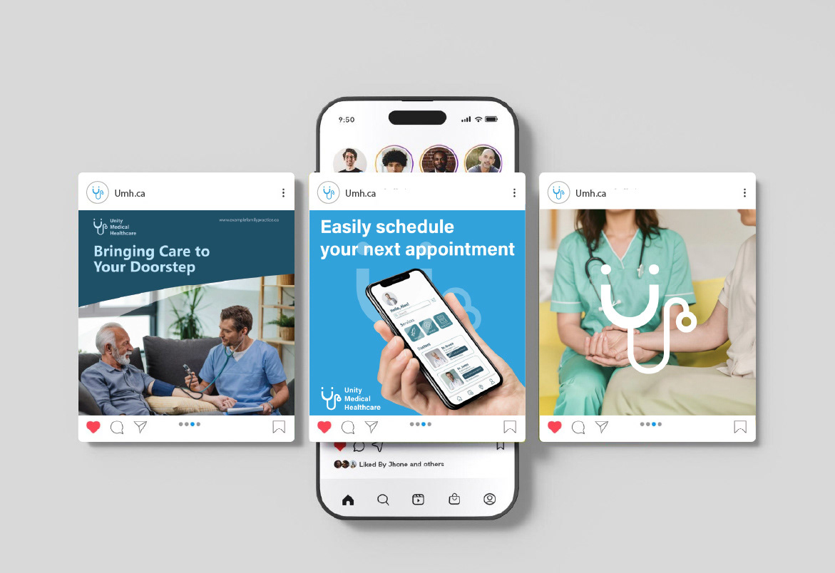
Communication & Advertising
The visual campaign focuses on clarity and reassurance, highlighting:
● Ease of booking
● Accessibility of services
● Human-centered care
● Ease of booking
● Accessibility of services
● Human-centered care
The messaging is designed to feel supportive rather than overwhelming, making healthcare more approachable.
Brand Application
The identity extends across multiple touchpoints:
● Clinic signage
● Mobile interface
● Social media content
● Printed materials
● Clinic signage
● Mobile interface
● Social media content
● Printed materials
Each touchpoint reinforces the same tone: clear, caring, and trustworthy.
Outcome
The result is a cohesive brand and digital system that improves both perception and usability,
helping Unity Medical Healthcare feel more accessible, reliable, and easier to engage with.