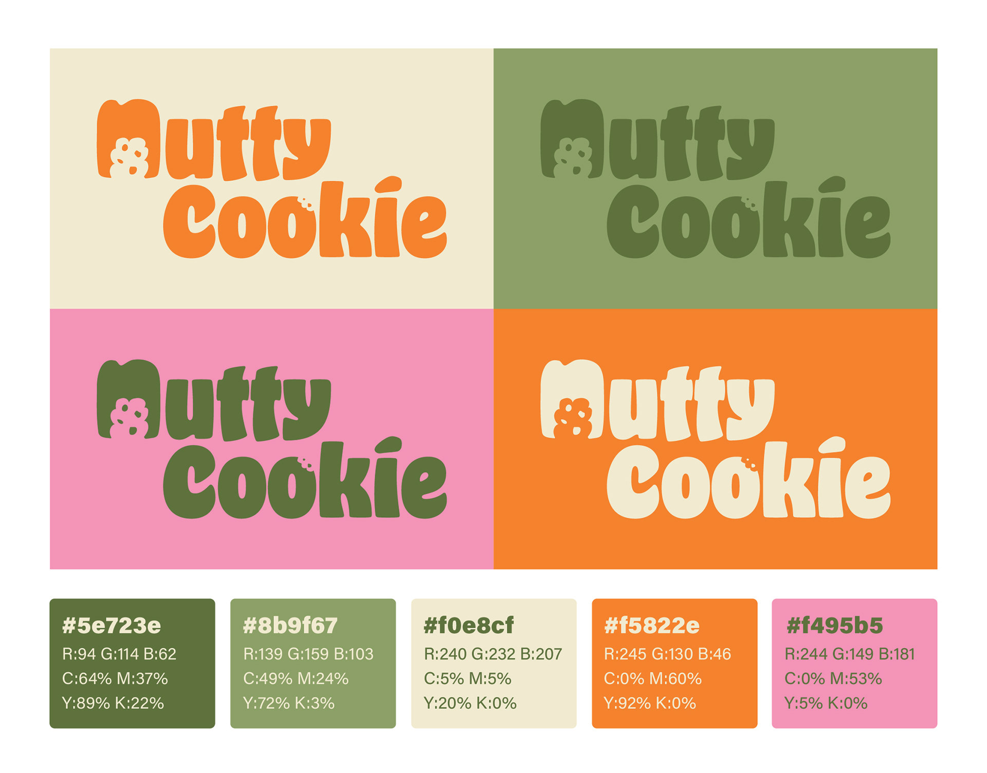
Logo Design and Colour Palette
The Nutty Cookie logo and color palette were designed to reflect the brand’s joyful and nourishing spirit. The bold, rounded letterforms convey friendliness and approachability, while the cookie-inspired details add a sense of fun and indulgence. The color palette combines warm earth tones with vibrant accents, symbolizing both natural ingredients and the lively energy of sharing a treat. Together, these elements create a visual identity that feels modern, inclusive, and instantly memorable.
The Challenge
Most healthy snack brands tend to follow a similar visual direction — minimal, muted, and often lacking personality.
For Nutty Cookie, the goal was to:
● Stand out in a saturated “healthy food” market
● Avoid looking overly clinical or restrictive
● Appeal to a broader, lifestyle-driven audience
● Build a cohesive brand system for a startup with a limited budget
● Avoid looking overly clinical or restrictive
● Appeal to a broader, lifestyle-driven audience
● Build a cohesive brand system for a startup with a limited budget
My Role
I developed the brand from the ground up, including:
● Brand identity and visual direction
● Logo design and variations
● Color palette and typography system
● Brand guidelines
● Packaging design
● Social media visual direction
● Website visual concept
● Logo design and variations
● Color palette and typography system
● Brand guidelines
● Packaging design
● Social media visual direction
● Website visual concept
Concept & Direction
Instead of following the conventional “clean and minimal” approach often seen in health-focused brands, the visual direction was built around playfulness and energy.
Bold color combinations, rounded typography, and friendly graphic elements were used to create a brand that feels:
● More approachable
● More enjoyable
● Less restrictive
● More aligned with everyday lifestyle consumption
● More enjoyable
● Less restrictive
● More aligned with everyday lifestyle consumption
This direction helps position Nutty Cookie not just as a “healthy option,” but as a brand people actually want to engage with.
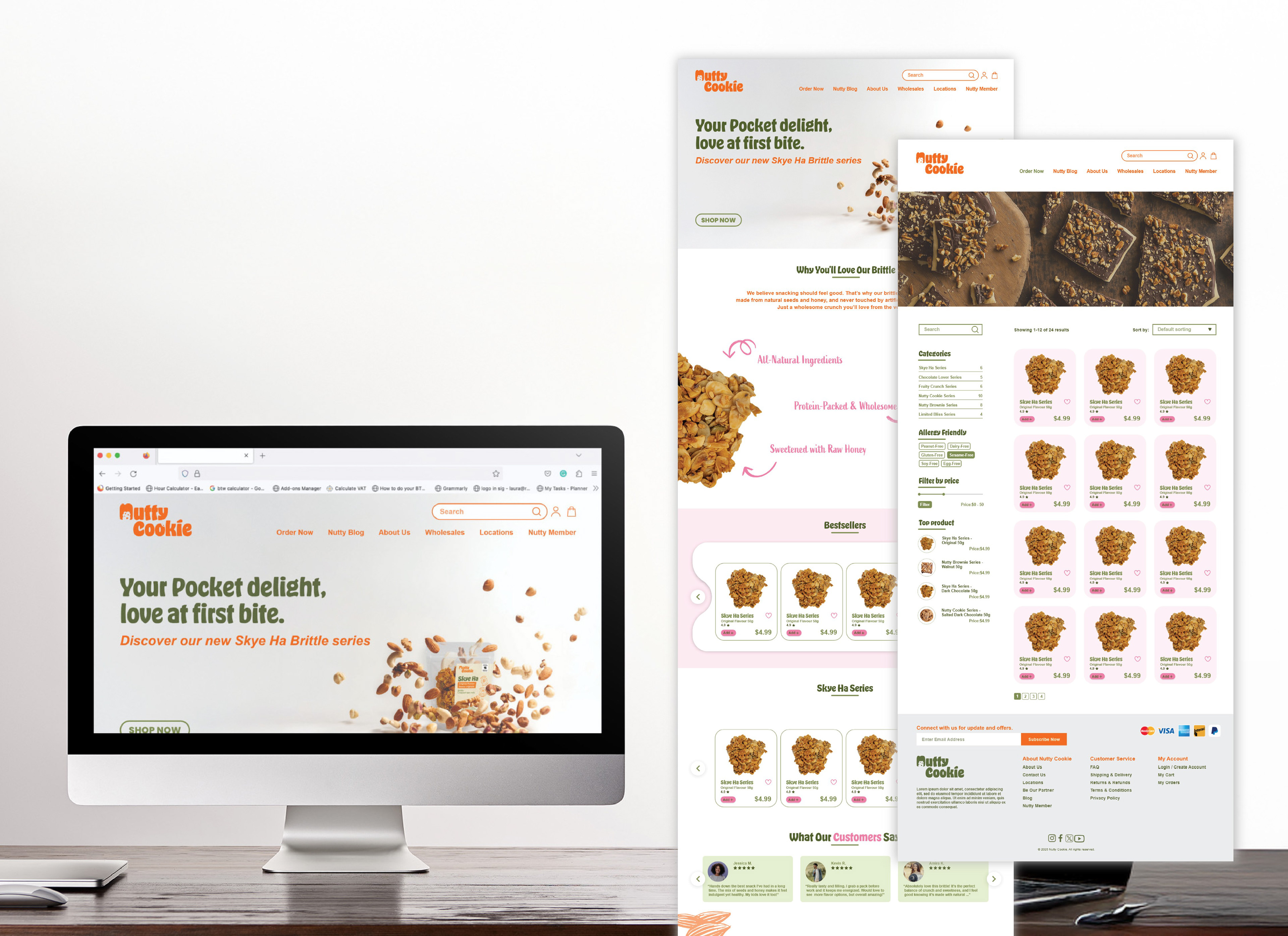
Visual Identity System
The logo features soft, rounded letterforms paired with subtle playful details, reinforcing the brand’s friendly tone.
The color palette combines warm, natural base tones with vibrant accents to reflect both:
● Natural ingredients
● The joy of snacking
● The joy of snacking
A flexible visual system was created to ensure consistency across all touchpoints, while allowing room for variation in future product lines.
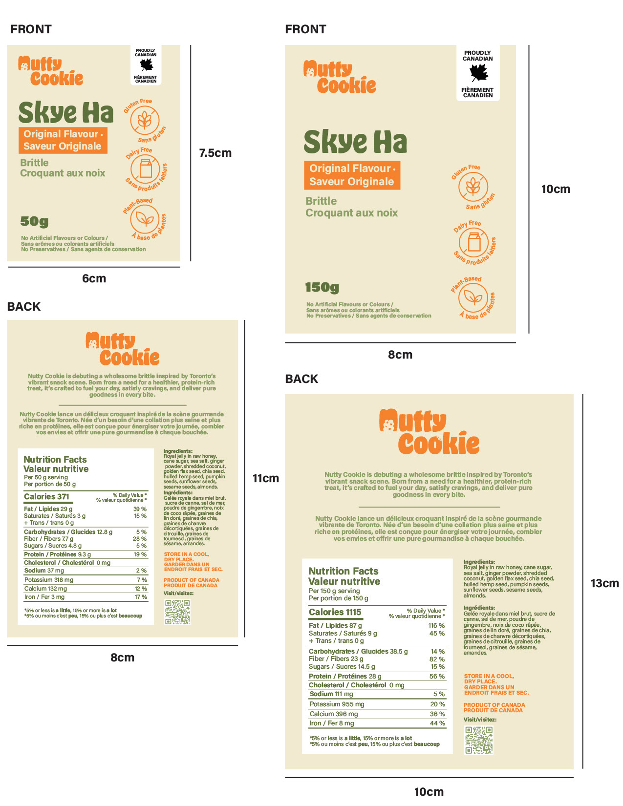
Packaging Design
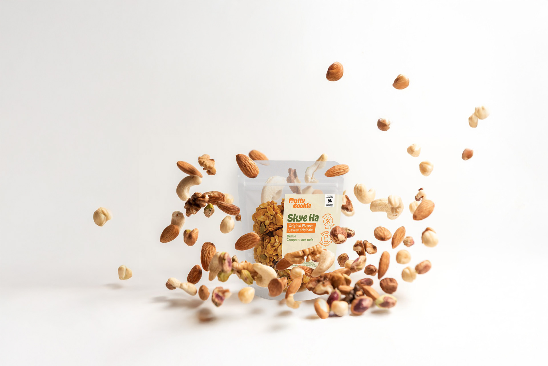
Packaging Design
The packaging was designed to be:
● Clear and easy to understand
● Visually distinctive on shelf
● Cost-efficient for production
● Visually distinctive on shelf
● Cost-efficient for production
Information hierarchy was simplified to highlight key product benefits, while maintaining a clean and approachable layout.
The system allows the brand to expand into multiple flavors without losing consistency.
Brand Application
The identity was extended across multiple touchpoints, including:
● Product packaging
● Outdoor advertising
● Business cards
● Social media content
● Website interface
● Outdoor advertising
● Business cards
● Social media content
● Website interface
Each application reinforces the same tone, friendly, energetic, and accessible, ensuring a cohesive brand experience.
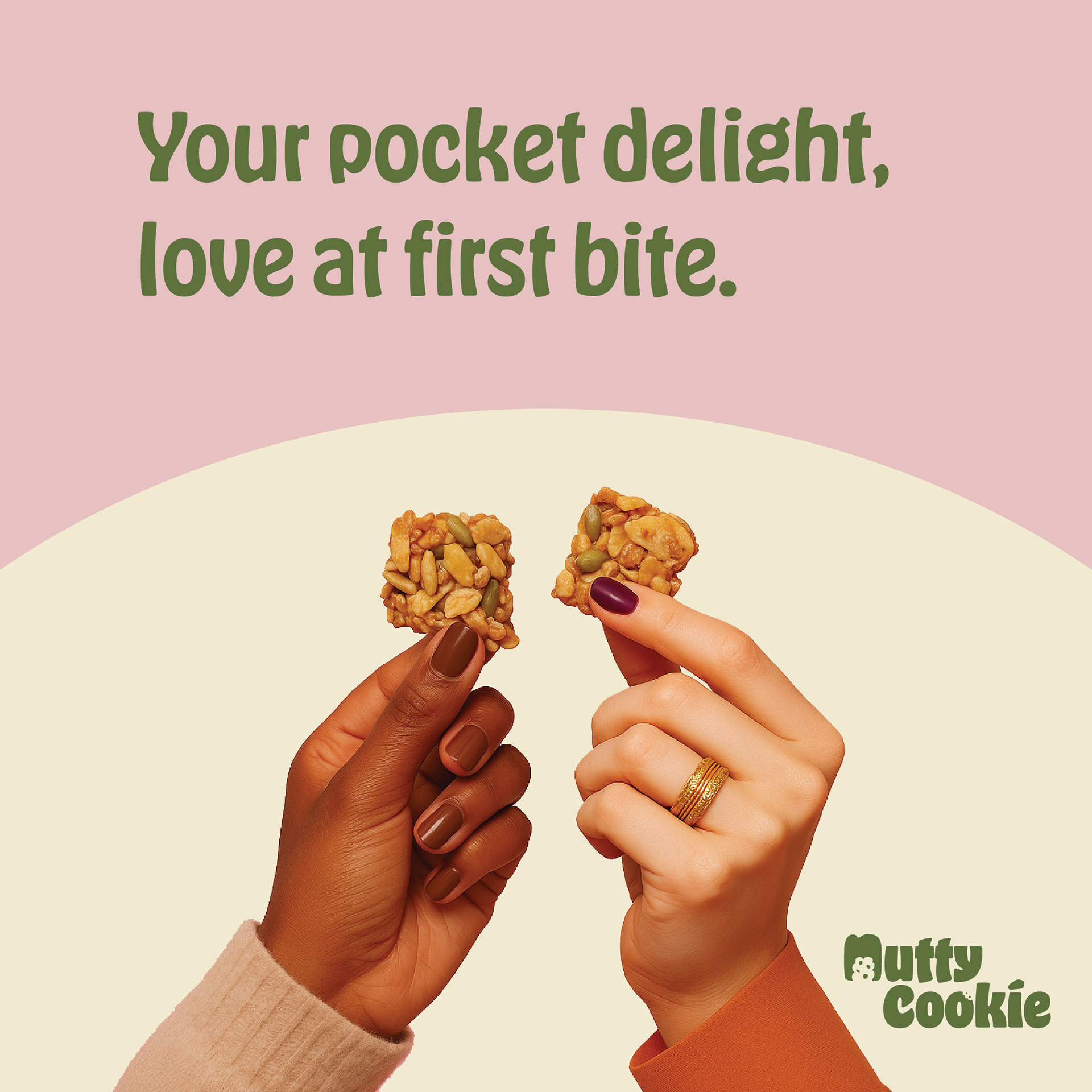
Social Media Post Design
Billboard Design Mockup

Name Card Design Mockup
Working Within Constraints
As a startup brand with a limited budget, the system was intentionally designed to be:
● Scalable
● Easy to reproduce
● Adaptable across formats
● Easy to reproduce
● Adaptable across formats
This ensures that the brand can grow without requiring a full redesign at every stage.
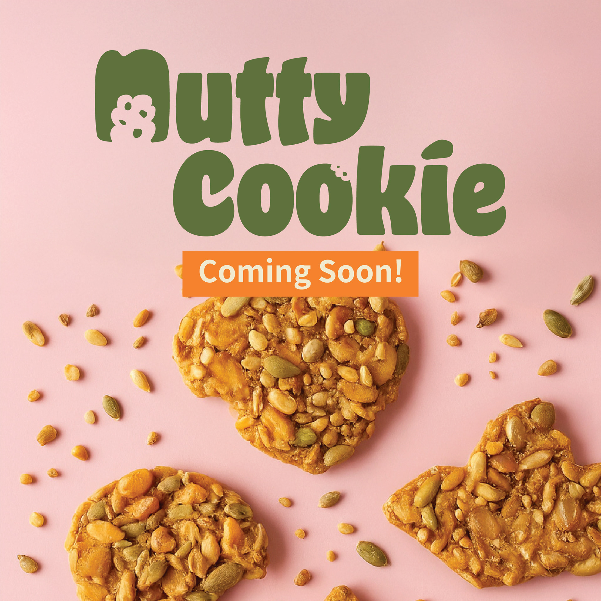
Social Media Design: Fun & Engaging Visuals
Nutty Cookie’s social media presence captures the same energy and friendliness as the brand itself. Bold typography, fun compositions, and vibrant color blocks keep the visuals eye-catching and shareable. Posts highlight product features, ingredient stories, and seasonal promotions in a way that feels authentic and engaging. The mix of lifestyle imagery and snack-focused visuals positions Nutty Cookie as both wholesome and fun, encouraging followers to not just purchase, but also connect with the brand story and community.
Outcome
The result is a cohesive and flexible brand system that helps Nutty Cookie stand out from traditional healthy snack brands,
creating a visual identity that feels both distinctive and easy to connect with.