
The Challenge
Many pet brands either lean toward:
● Generic corporate retail aesthetics
● Or overly childish visuals without strong brand structure
● Or overly childish visuals without strong brand structure
This project explores how to create a brand that is:
● Distinctive but still approachable
● Playful but not unprofessional
● Memorable beyond just a logo
● Designed to build connection with pet owners
● Playful but not unprofessional
● Memorable beyond just a logo
● Designed to build connection with pet owners
My Role
I developed a complete brand identity system, including:
● Logo design and variations
● Brand visual direction
● Custom illustration and pattern system
● Merchandise design
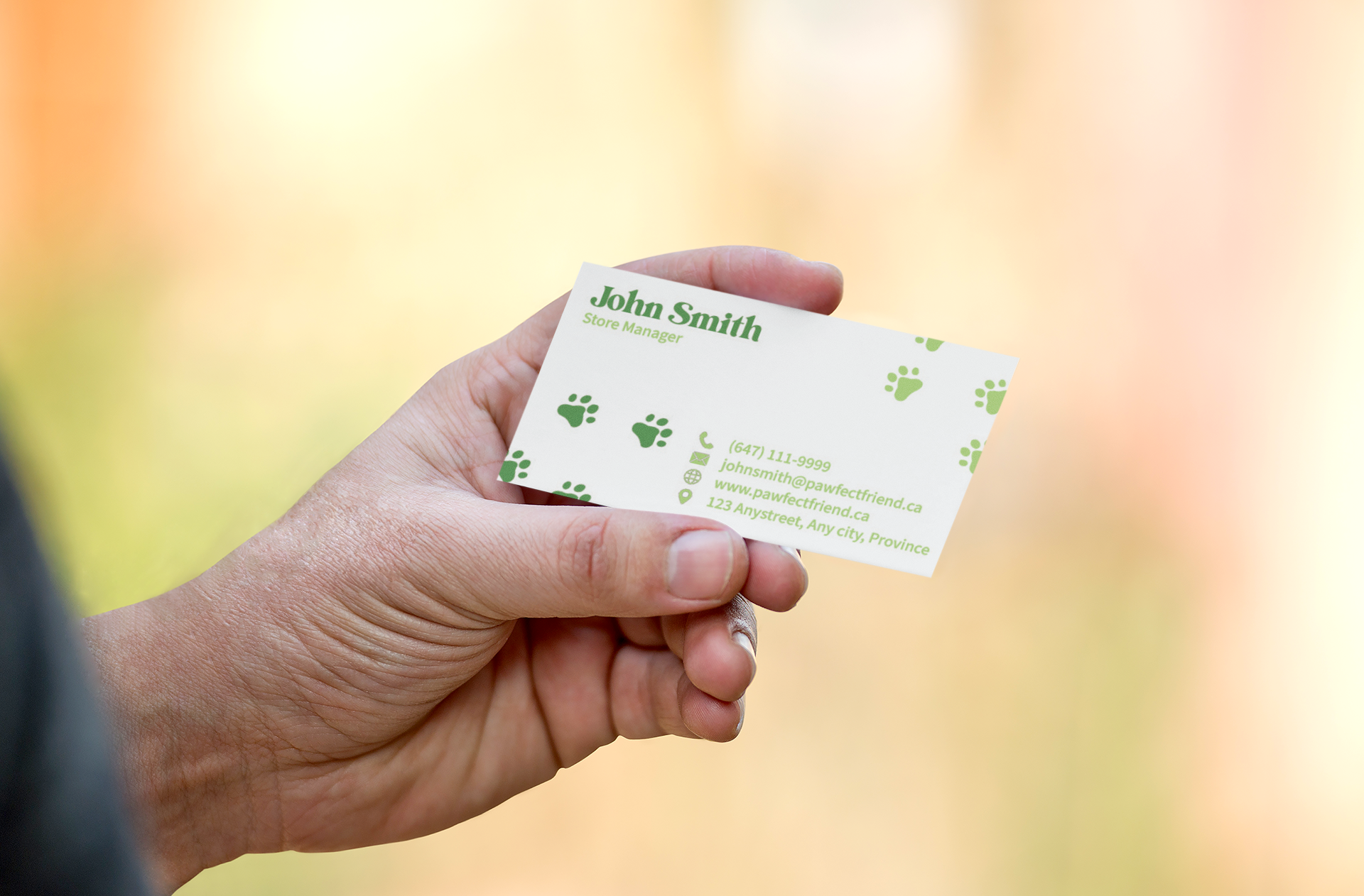
● Print materials (business card, tote bag)
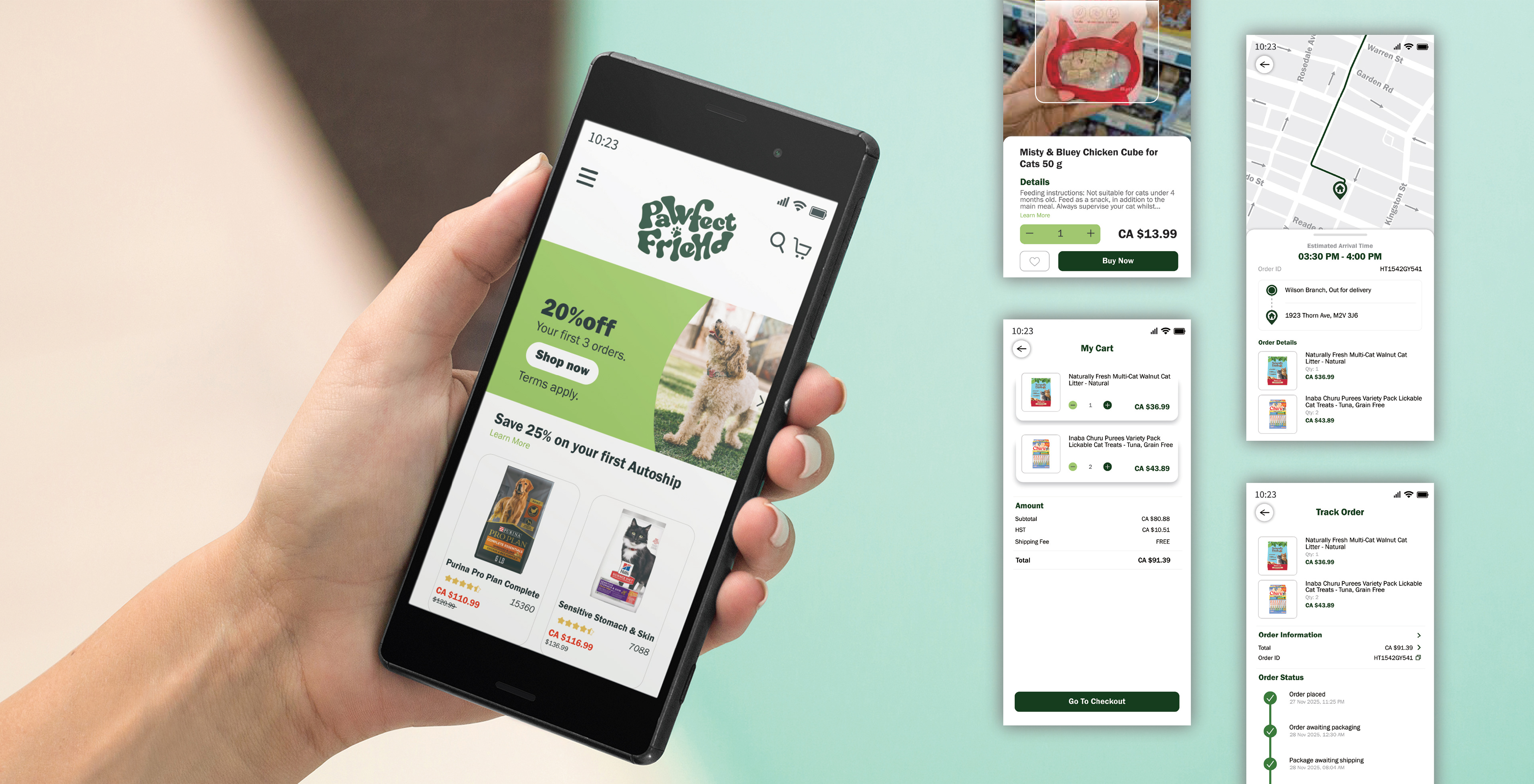
● Website and mobile UI concept
● Brand visual direction
● Custom illustration and pattern system
● Merchandise design
● Print materials (business card, tote bag)
● Website and mobile UI concept
Concept & Strategy
Instead of treating branding as just a visual identity, this project positions the brand as a community-driven pet lifestyle brand.
The key idea was:
➠ Turn brand assets into everyday marketing tools
Rather than relying only on ads, the brand extends into real life through items like tote bags and merchandise that customers naturally carry and use.
This allows the brand to:
● Increase visibility organically
● Create emotional attachment
● Encourage word-of-mouth through lifestyle integration
● Create emotional attachment
● Encourage word-of-mouth through lifestyle integration
Logo Mark: Simple & Versatile Representation
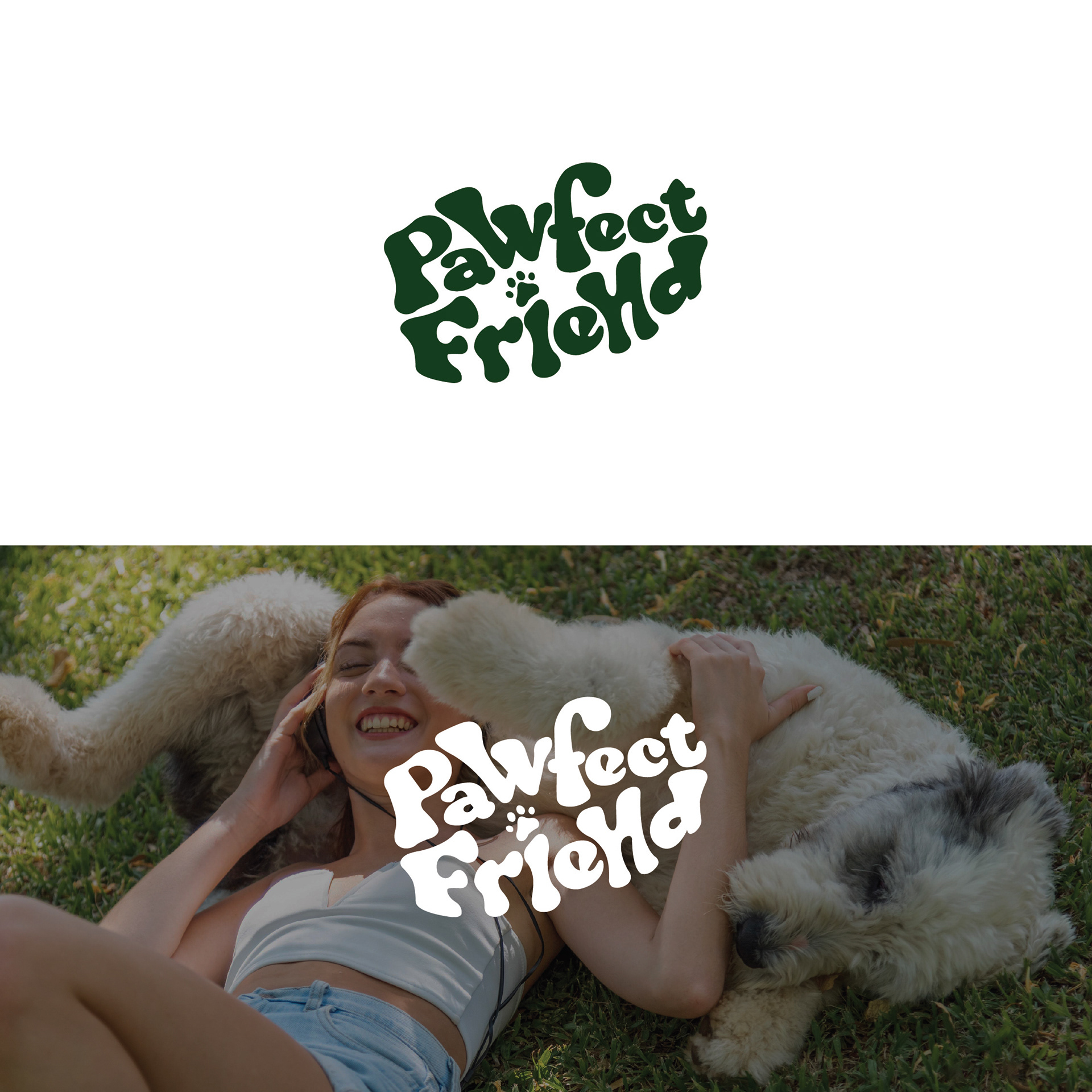
The PF logo mark is a condensed version of the brand identity, designed for flexibility across different applications. Using the same fluid and playful typography, it maintains the brand’s cheerful vibe while ensuring adaptability for icons, social media profiles, packaging, and merchandise. The paw print detail adds an extra touch of personality, keeping the brand’s essence strong even in its simplest form.
The PF logo mark is a condensed version of the brand identity, designed for flexibility across different applications. Using the same fluid and playful typography, it maintains the brand’s cheerful vibe while ensuring adaptability for icons, social media profiles, packaging, and merchandise. The paw print detail adds an extra touch of personality, keeping the brand’s essence strong even in its simplest form.
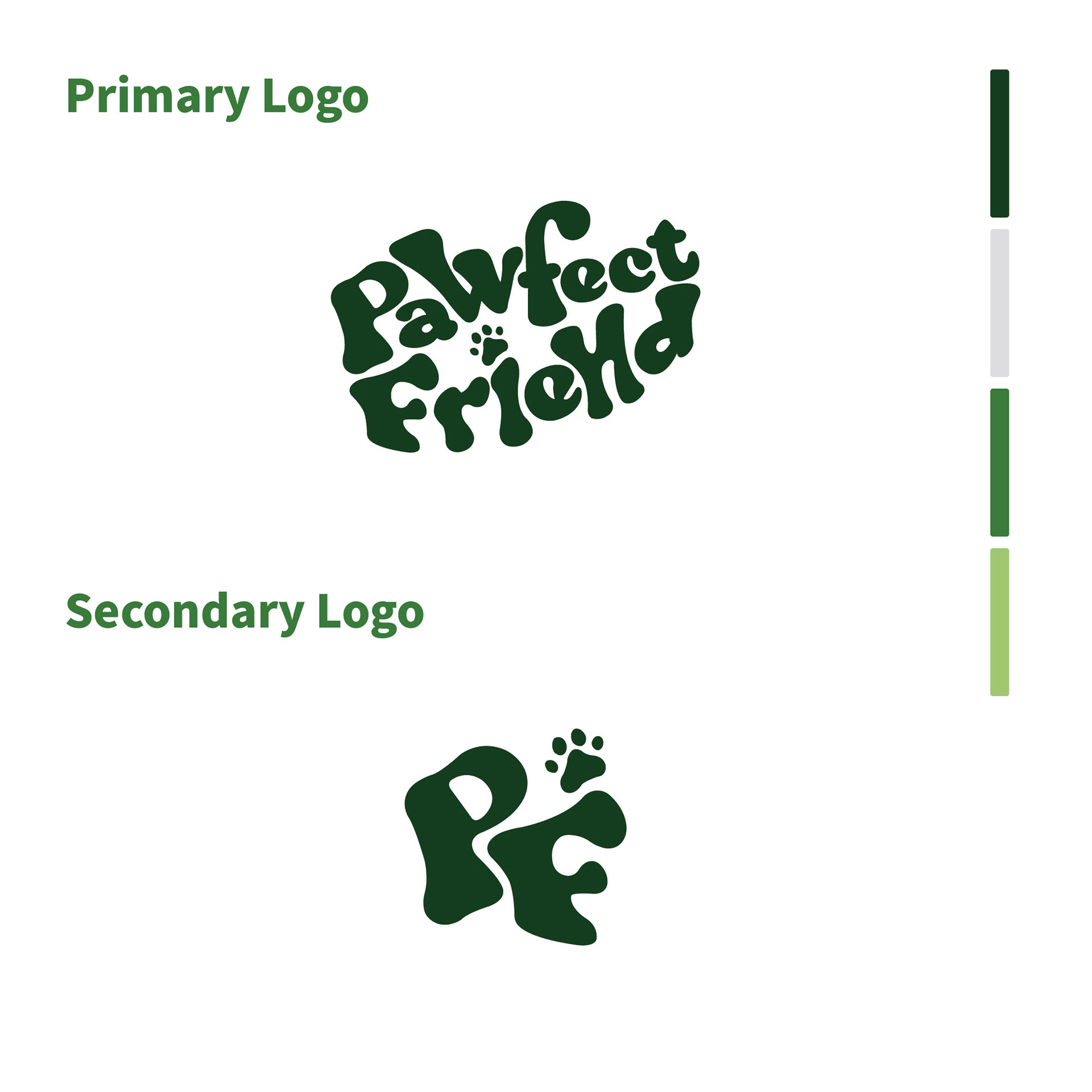
Primary Logo: Playful & Approachable Identity
The Pawfect Friend primary logo embodies the brand’s friendly and welcoming personality. With its bubbly, hand-drawn lettering and organic shapes, the design feels warm and inviting—just like a neighborhood pet shop should. The playful curves and the subtle paw print detail reinforce the connection to pets, making it instantly recognizable and easy to remember.
The Pawfect Friend primary logo embodies the brand’s friendly and welcoming personality. With its bubbly, hand-drawn lettering and organic shapes, the design feels warm and inviting—just like a neighborhood pet shop should. The playful curves and the subtle paw print detail reinforce the connection to pets, making it instantly recognizable and easy to remember.
Logo Mark: Simple & Versatile Representation
The PF logo mark is a condensed version of the brand identity, designed for flexibility across different applications. Using the same fluid and playful typography, it maintains the brand’s cheerful vibe while ensuring adaptability for icons, social media profiles, packaging, and merchandise. The paw print detail adds an extra touch of personality, keeping the brand’s essence strong even in its simplest form.
The PF logo mark is a condensed version of the brand identity, designed for flexibility across different applications. Using the same fluid and playful typography, it maintains the brand’s cheerful vibe while ensuring adaptability for icons, social media profiles, packaging, and merchandise. The paw print detail adds an extra touch of personality, keeping the brand’s essence strong even in its simplest form.

Visual Identity System
The logo uses soft, rounded letterforms and organic shapes to reflect warmth and friendliness.
Subtle paw details and playful composition reinforce the connection to pets without feeling overly literal.
The identity is designed to feel:
● Welcoming
● Light-hearted
● Community-oriented
● Light-hearted
● Community-oriented
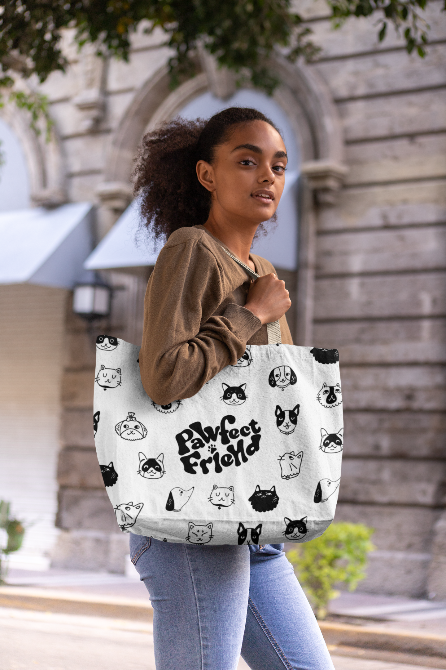
Illustration & Pattern System
A custom illustration system was developed using simple, expressive pet characters.
These illustrations:
● Add personality and charm
● Create a recognizable visual language
● Allow flexible use across different applications
● Create a recognizable visual language
● Allow flexible use across different applications
The black-and-white pattern ensures versatility while maintaining a playful tone.
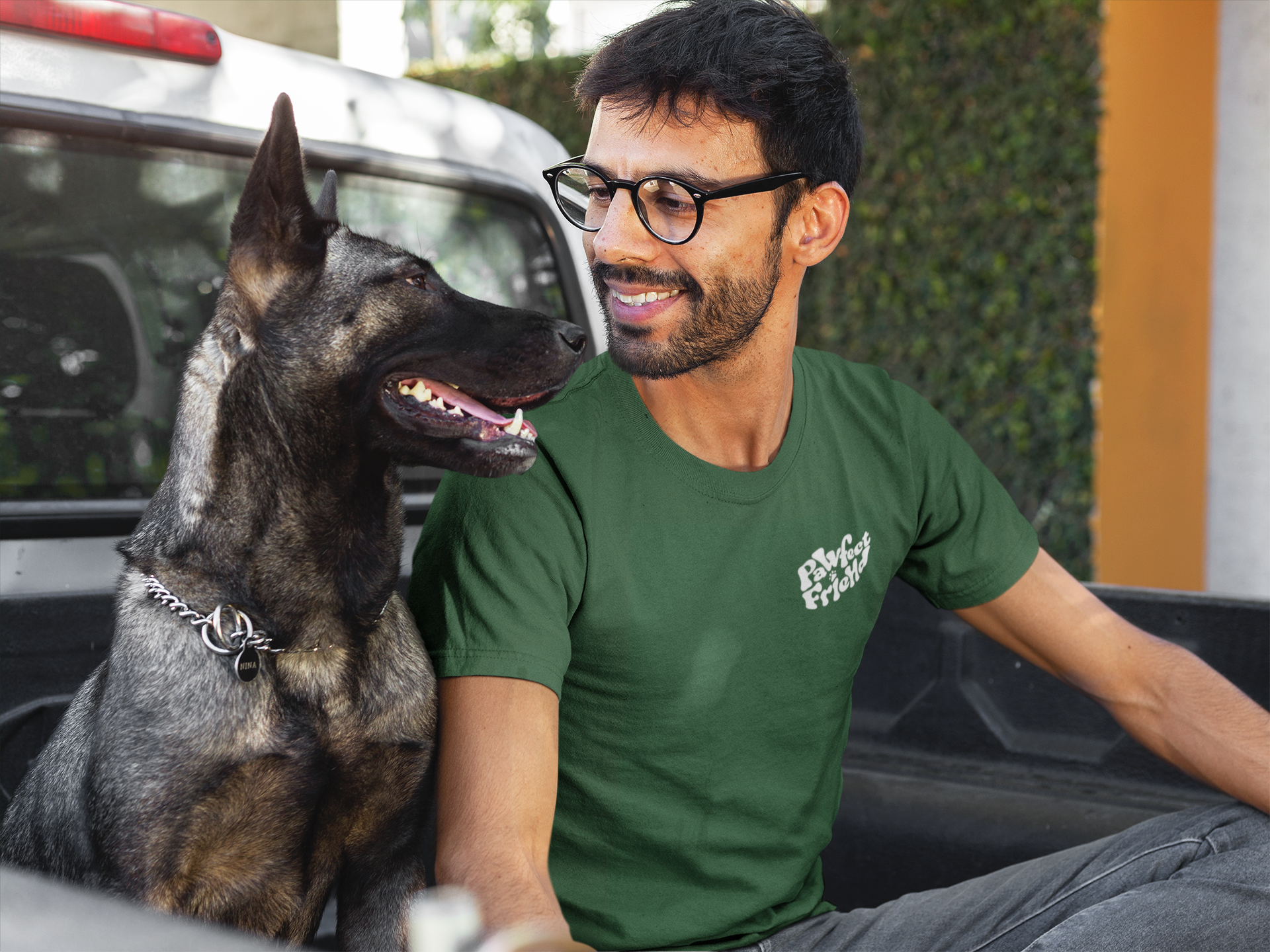
Brand Application
The identity is applied across multiple touchpoints:
● Tote bags and merchandise
● Business cards
● Packaging-ready assets
● Website and mobile experience
● Business cards
● Packaging-ready assets
● Website and mobile experience
Each touchpoint maintains a consistent tone while adapting to different contexts.
Outcome
The result is a cohesive and flexible brand system that positions Pawfect Friend as more than just a pet shop,
but as a community-centered brand that people can emotionally connect with and represent in their daily lives.