Logo Design and Colour Palette
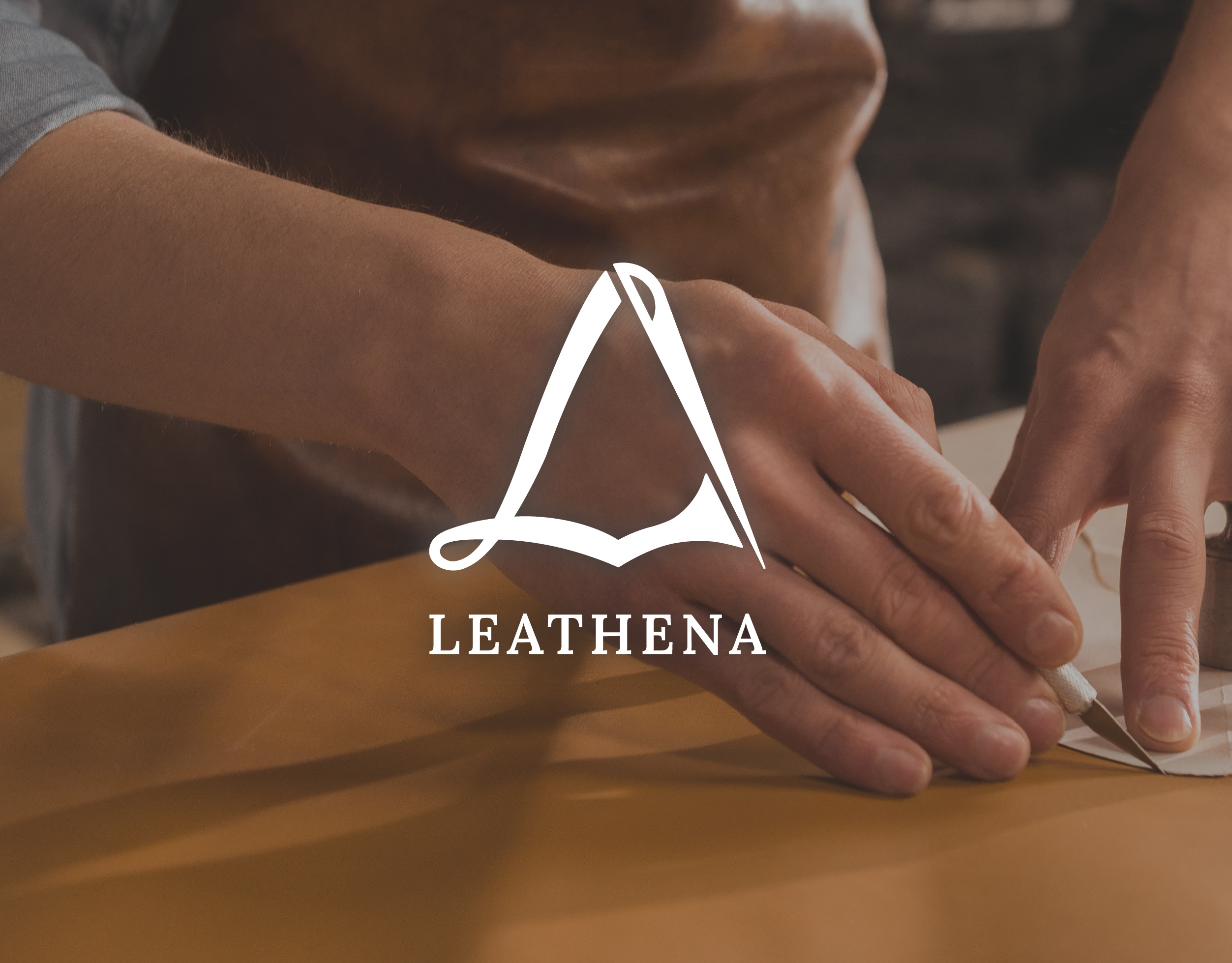
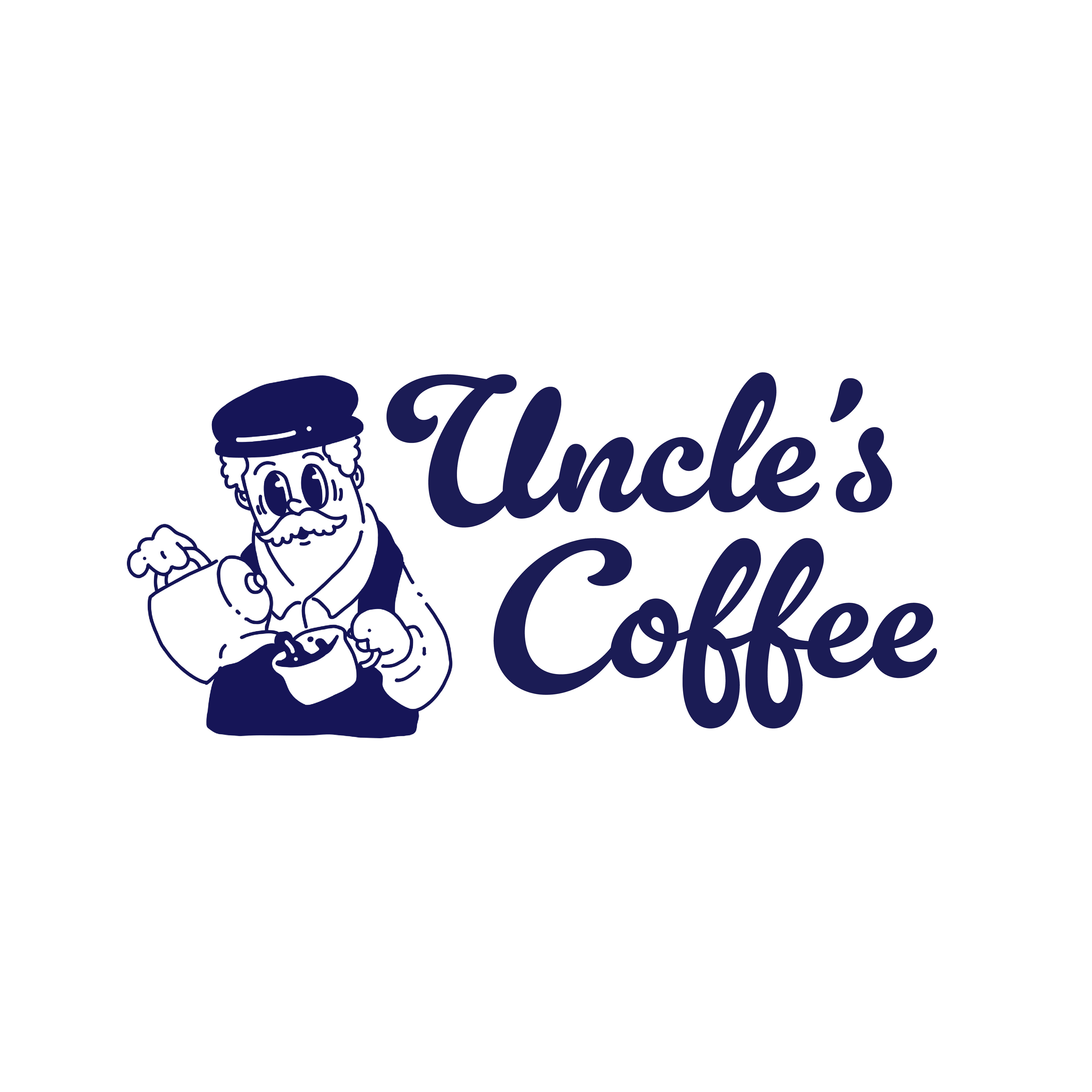
For the logo design, I chose a vintage 1920s-30s cartoon style. This playful, nostalgic style reflects the friendly, welcoming spirit of the cafe, while also connecting to the countryside charm of the shop. I selected a calming shade of blue to convey a sense of relaxation and to highlight the cafe’s dedication to the craft of coffee making.
For the logo design, I chose a vintage 1920s-30s cartoon style. This playful, nostalgic style reflects the friendly, welcoming spirit of the cafe, while also connecting to the countryside charm of the shop. I selected a calming shade of blue to convey a sense of relaxation and to highlight the cafe’s dedication to the craft of coffee making.
Pattern Ideas
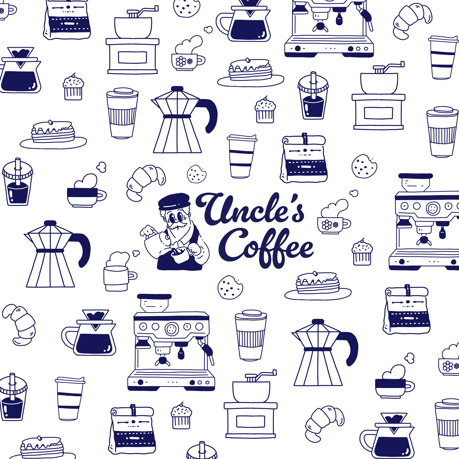
The pattern system extends the brand into a more playful and flexible visual language.
The pattern system extends the brand into a more playful and flexible visual language.
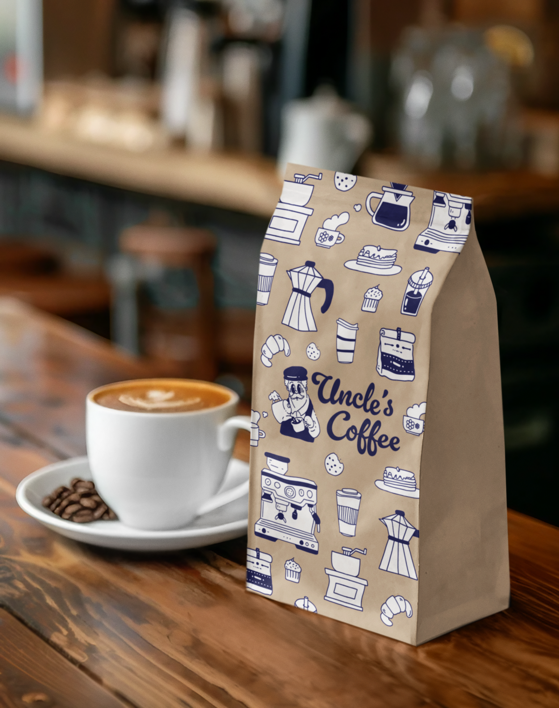
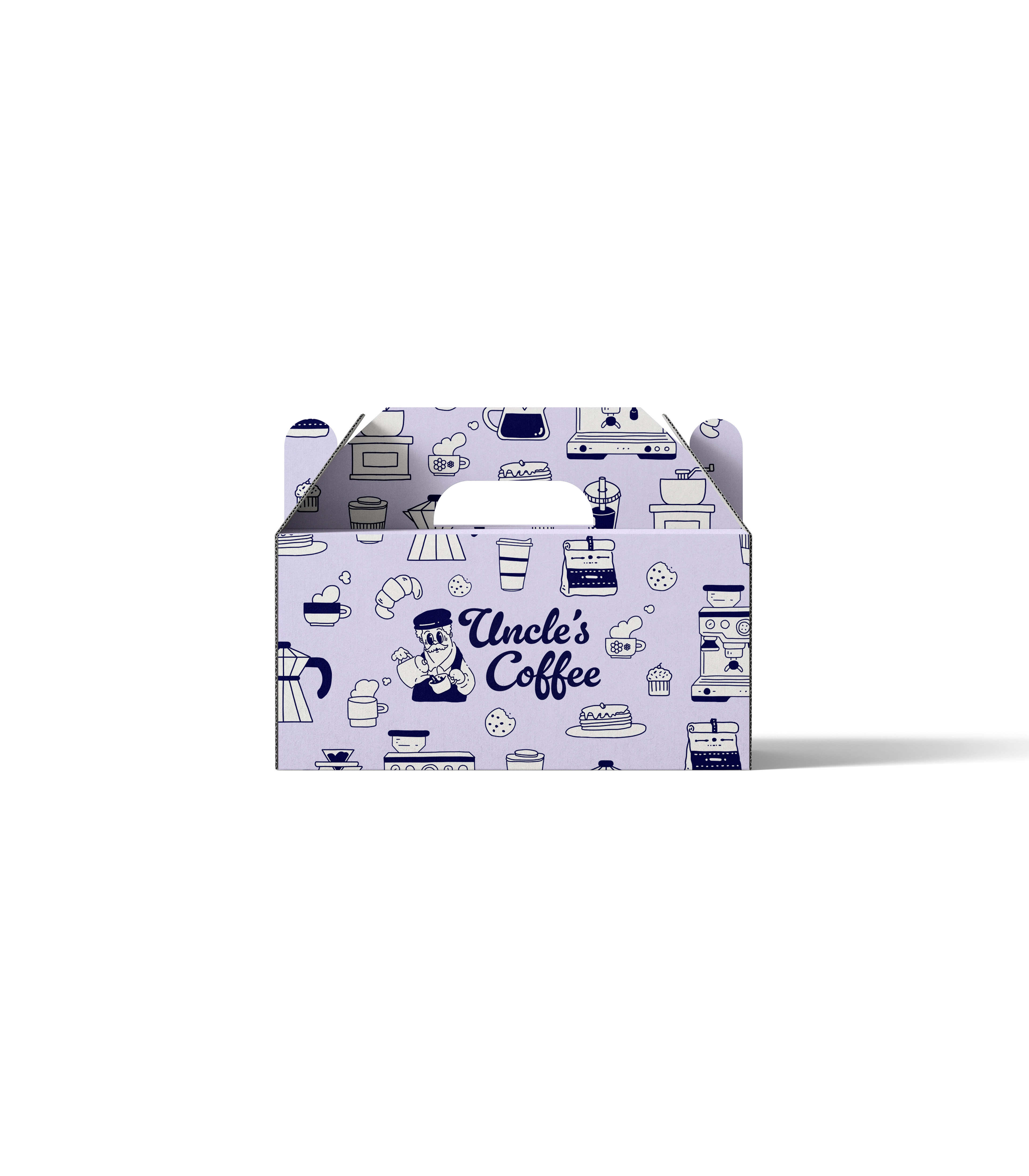
Featuring illustrated coffee tools and pastries, the patterns help reinforce the cafe’s identity while adding visual interest across packaging and printed materials.
• Coffee-related illustrations to support storytelling
• Monochromatic approach for consistency
• Designed for packaging and brand applications
• Coffee-related illustrations to support storytelling
• Monochromatic approach for consistency
• Designed for packaging and brand applications
Brand Design Concept
The brand is built around the idea of “a familiar figure” — someone who represents warmth, friendliness, and trust.
The illustrated character acts as the face of the brand, creating an immediate emotional connection and giving the cafe a recognizable personality. Paired with soft, rounded typography, the identity feels approachable and human-centered.
● Character-driven identity to build emotional connection
● Soft and rounded typography for a friendly tone
● Focus on familiarity rather than trend
● Soft and rounded typography for a friendly tone
● Focus on familiarity rather than trend
Visual Direction
The visual system draws from vintage-inspired aesthetics to create a sense of nostalgia and timelessness.
Instead of feeling old-fashioned, the design balances retro elements with clean composition, making the brand feel both cozy and relevant.
● Vintage-inspired illustration style
● Clean and balanced layout
● Designed to feel nostalgic yet contemporary
● Clean and balanced layout
● Designed to feel nostalgic yet contemporary
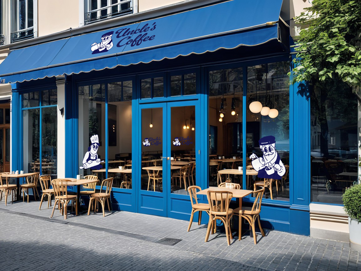
A cozy countryside cafe with a welcoming patio, where customers can enjoy their coffee under the sun. The design captures the spirit of slow living, inviting people to pause, relax, and savor simple moments in a warm, laid-back atmosphere.
Touchpoint Applications
The identity is applied across various touchpoints to demonstrate how the brand lives in a real-world setting.
From storefront to packaging, each element is designed to maintain consistency while enhancing the overall experience.
● Storefront and signage
● Packaging design
● Coffee bags and takeaway materials
● Menu design
● Packaging design
● Coffee bags and takeaway materials
● Menu design

Outcome
This project showcases how branding can create emotional connection through simplicity and familiarity.
By focusing on warmth, character, and everyday experience, the design builds a brand that feels welcoming, memorable, and easy to return to.