Logo Design
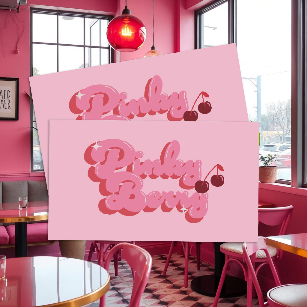
The Pinky Berry logo was inspired by a blend of 70s retro bubble typography and modern girly aesthetics. The lettering is soft, rounded, and full of personality, capturing a playful and approachable tone that reflects the cafe’s fun and friendly vibe. The rich pink tones paired with a bold cherry icon add a sweet, flirty touch, making the logo instantly recognizable and social-media ready. Sparkle accents were added to give it a dreamy, glossy feel, like a cherry on top of a perfect dessert. The goal was to create a nostalgic and trendy logo, perfectly matching the café’s lifestyle-driven identity.
The Pinky Berry logo was inspired by a blend of 70s retro bubble typography and modern girly aesthetics. The lettering is soft, rounded, and full of personality, capturing a playful and approachable tone that reflects the cafe’s fun and friendly vibe. The rich pink tones paired with a bold cherry icon add a sweet, flirty touch, making the logo instantly recognizable and social-media ready. Sparkle accents were added to give it a dreamy, glossy feel, like a cherry on top of a perfect dessert. The goal was to create a nostalgic and trendy logo, perfectly matching the café’s lifestyle-driven identity.
Pattern Design
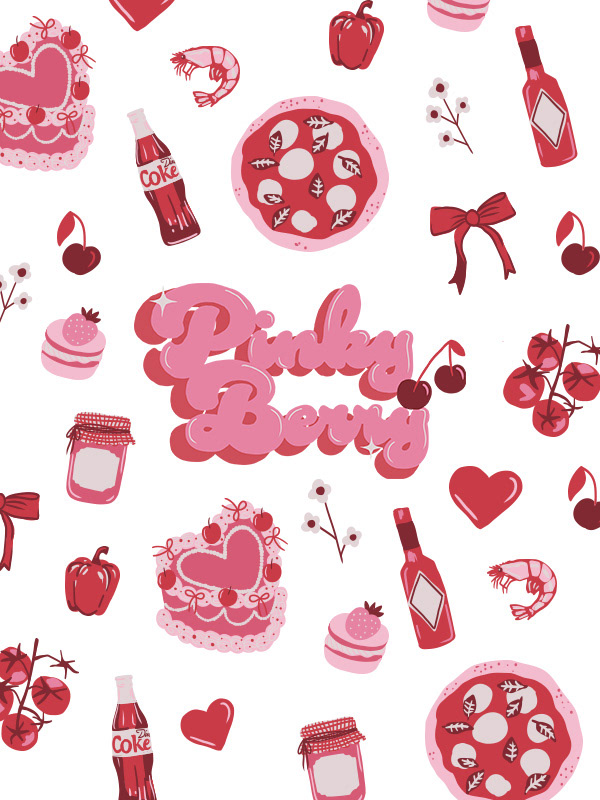
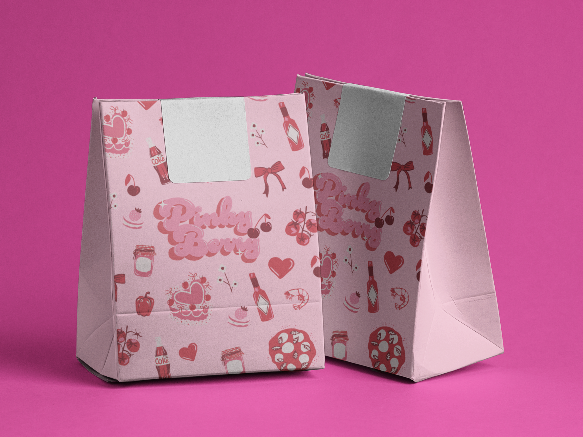
The pattern design builds on the whimsical, charming energy of the brand. It features a delightful mix of illustrated elements in a cohesive pink and red palette. These icons are playful and varied, echoing the joyful experience of stepping into the cafe. Each element was carefully chosen to reflect both the food offerings and the lifestyle mood of Pinky Berry.
The pattern design builds on the whimsical, charming energy of the brand. It features a delightful mix of illustrated elements in a cohesive pink and red palette. These icons are playful and varied, echoing the joyful experience of stepping into the cafe. Each element was carefully chosen to reflect both the food offerings and the lifestyle mood of Pinky Berry.
The Challenge
In today’s cafe landscape, good food alone is no longer enough to stand out.
Many cafes struggle to:
● Create a strong visual identity that people remember
● Encourage customers to share their experience online
● Turn physical visits into digital visibility
● Create a strong visual identity that people remember
● Encourage customers to share their experience online
● Turn physical visits into digital visibility
This project explores how branding can be used strategically to drive social sharing and organic reach.
My Role
I developed a full brand concept, including:
● Brand identity and visual direction
● Logo design and typography system
● Illustration and pattern design
● Packaging concept (takeout box & bags)
● Brand application across physical and digital touchpoints
● Logo design and typography system
● Illustration and pattern design
● Packaging concept (takeout box & bags)
● Brand application across physical and digital touchpoints
Concept & Strategy
The core idea is:
➠ Design the café to be “social-media-ready” at every touchpoint
Instead of relying on traditional advertising, the brand is built to generate exposure through:
● Customer-generated content
● Shareable visual moments
● Packaging that travels beyond the store
● Customer-generated content
● Shareable visual moments
● Packaging that travels beyond the store
This turns customers into natural promoters of the brand.
Visual Identity
The identity embraces a bold, girlish, and playful aesthetic using:
● Rich pink color palette
● Retro-inspired bubble typography
● Cherry and dessert-inspired elements
● Retro-inspired bubble typography
● Cherry and dessert-inspired elements
The goal is to create an instantly recognizable visual style that stands out both in real life and on social feeds.
Pattern & Brand Language
A cohesive illustration system was developed to reinforce the brand’s personality.
The playful icons and patterns:
● Add depth to the brand experience
● Create repeatable visual assets
● Enhance consistency across packaging and space
● Add depth to the brand experience
● Create repeatable visual assets
● Enhance consistency across packaging and space
This helps the brand remain visually engaging across multiple platforms.
Packaging Design Idea
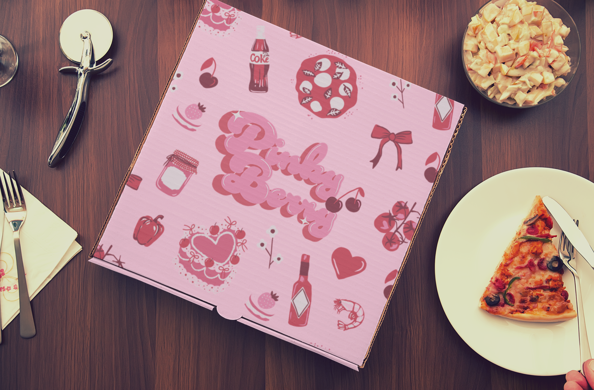
The Pinky Berry pizza box was designed in a vibrant pink tone to instantly catch attention on the street or on camera. The bold colour choice, combined with playful illustrations and a standout logo, creates a fun and girlish look that elevates the unboxing experience. Designed with social sharing in mind, the layout is perfect for flatlays and adds a pop of personality to every slice.
The Pinky Berry pizza box was designed in a vibrant pink tone to instantly catch attention on the street or on camera. The bold colour choice, combined with playful illustrations and a standout logo, creates a fun and girlish look that elevates the unboxing experience. Designed with social sharing in mind, the layout is perfect for flatlays and adds a pop of personality to every slice.
Packaging as Marketing
The packaging is designed not just for function, but as a key marketing tool.
Takeout boxes and bags are:
● Highly visual
● Instantly recognizable
● Designed to appear in photos and social posts
● Highly visual
● Instantly recognizable
● Designed to appear in photos and social posts
When customers carry or share them, the brand gains free exposure and extended reach beyond the cafe.
Brand Experience
Every element of the brand is designed to support:
● Photo-friendly environments
● Shareable moments
● A lifestyle-driven experience
● Photo-friendly environments
● Shareable moments
● A lifestyle-driven experience
From in-store visuals to takeaway packaging, the brand encourages customers to engage, document, and share.
Outcome
The result is a cohesive brand concept that positions Pinky Berry Cafe as a social-media-first cafe,
where branding, environment, and packaging work together to create continuous organic visibility.
where branding, environment, and packaging work together to create continuous organic visibility.